
Level Studios
•
2022 - Present
Brightspeed
Four years designing the flows customers use to buy and manage internet service, and the mobile design system that keeps them consistent across web and native.
Embedded in Brightspeed's product team through Level Studios, I designed the buy flow, account management, customer-facing pages, and mobile experiences alongside a small UI and UX team, and helped build the design systems every one of those flows runs on.
Role
Product Designer
Timeline
2022 - Present
Agency
Level Studios
Deliverables
Design Systems, Web, Mobile, Buy Flows, Account Management

Overview
Rebuilding the system behind how Brightspeed sells and serves
Brightspeed is a broadband provider serving customers across 20 states. Formed in 2022 from assets, it inherited web frameworks from its former companies but very little of its own: no buy flow, no account management, an undefined public site, and no shared rules to build any of them from. Every part of the digital customer experience had to be built from the ground up, and quickly, for a company already selling service.
Over four years, the design team and I built that foundation as one architecture with three foundations, then shipped both revenue-critical experiences on top of it: the flow that brings customers in and the flow that keeps them.
Context
What we inherited
Brightspeed launched with an ambitious goal and systems unable to sustain it. It inherited web frameworks from its former companies but had very little of its own: no buy flow, no account management, an undefined public site, and no shared rules to build them from. Every one of those experiences had to exist, and quickly, for a company already selling in 20 states. The first problem was not a screen. Nothing could be built at scale until there was a system to build it from.
Problem
Two revenue levers, no foundation under them
Buy flow and account management are the two biggest levers in Brightspeed's business: acquisition and retention. One brings customers in, the other keeps them. Both needed to be built, and both had to handle every customer type differently. A prepaid customer might see a credit check they would never pass. A DSL-to-fiber migrator could see WiFi upgrades they couldn't buy. Account management, where the same customer lands after the sale, had to show a bill or change a plan speed without making anyone hunt.
By the end of 2023 the Lower Funnel groundwork was in place, but the buy flow was still converting between 12.5 and 13 percent against a 20 percent target. The gap was the assignment.
Baseline Conversion
Business Target
Research
What shaped the work
Two tracks, two kinds of evidence. The buy flow's postpaid addition ran on exploratory research from Level's strategy team. The app ran on what a live product left behind: analytics, app store reviews, and the journeys customers were already working through. We took the strongest evidence available for each and turned it into the same output: specifications for the components the flows were built from.

Buy flow
Before the buy flow moved from prepaid to postpaid, Level's strategy team conducted interviews with customers across age groups, household types, income levels, and service preferences. The findings showed where the flow was most likely to lose people. Deposits drove the most abandonment, sharpest among older customers, lower-income households, and anyone new to postpaid, and tolerance varied by age. Younger customers moved through verification and conditional offers without much friction; older customers worried about their data, their credit, and a surprise fee.
The journey itself told most of the story. Prepaid was a seven-step purchase. Postpaid stretched that to eleven, adding identity verification, a credit check, a possible deposit, and qualification for the $10 AutoPay and Paperless Billing discount. From a system's point of view, four new steps meant a new inventory of components needed to be designed: passcode inputs with resend and timeout states, a knowledge-based fallback, a processing state that reads as progress, soft-fail and recovery states, outcome screens with the deposit amount and refund terms, a discount treatment on the plan card, a consequence modal for the credit-card path, and a status component with four eligibility variants that had to carry from checkout into account management. None of it existed in the Lower Funnel foundation before postpaid.
Out of that research, the team aligned on five principles: lead with transparency, show value before qualification, reduce perceived risk, leave no dead end, and set expectations early. For the flow, those were UX principles. For myself, these were dialed specifications. For the UI team, the research set the bar for every one of those states: if a customer's hesitation came from not knowing, the design had to answer that question immediately.

App
The team reviewed customer analytics, app store feedback, customer archetypes, the existing journeys, and the business requirements. The reviews told a consistent story: frustration with billing visibility, service status, appointment tracking, and getting into the account at all.
Customers open a utility app with a few questions and expect them answered in seconds. Is my service working? Is my bill paid? When is my appointment? Do I need to do anything? The existing app made them hunt for those answers. Information was scattered across sections, billing competed with promotions, and every notification looked the same whether it announced an outage or a discount. The pattern underneath was a mental model the team named plainly: fix what’s broken, prevent the next problem, stay informed, then optimize.
Process
How we worked
The work ran in lean, focused tracks. Flows were prioritized according to their impact on the business and taken on in that order, most in one-to-two-week cycles, with UI, UX, copy, product, and engineering in the loop from the first frame to handoff. Every flow was first built in a foundation file, then published through its child library, and finally, its composition file so each decision could reach every screen.

Buy flow
Each flow began with direction from the client. Sometimes that came as a creative brief, sometimes through Brightspeed's product owner, and in every case it was grounded in the previous design rules and the Confluence documentation behind them. From those, we identified the functionality each step had to support and how each component would need to be redesigned to carry it. UX took the first pass, producing wireframes that pinned down each flow before it reached UI. Every day over the course of a month, the design team met to brainstorm, pressure-test ideas, and find ways to raise the quality of every touchpoint across the buy flow.
My job as a UI designer was to make our aligned principles and vision shine brightly at every step. That meant a prominent passcode input with resend and timeout states, a easy to use processing screen that reads as reassuring progress rather than a stall, soft-fail and recovery states with a clear next action, detailed outcome screens that put the deposit amount and refund terms in the right place, a discount badge on the plan card so the incentive is visible before the customer commits, and a measured credit-card modal that explains what's forfeited and weights the information it displays without creating friction.
Our efforts started with the most contained flow, Select a plan, and we honed our approach before we tackled the other buy flow steps. With same day turnarounds and on-call design sign-offs, I marched to contribute with building the components and elements that each flow required directly into the Lower Funnel foundation. My design approach was atomic. I began with the smallest design element and build outward. Text stacks, button stacks, cards, navigation, and footers were each built with multiple variants and carefully structured Figma properties, so that assembling a screen in the composition file became a matter of selecting and configuring rather than redrawing.
As the flows progressed, the components matured with them, taking on new requirements as the business and the brand refined what each step needed to do. Customize your package, value packages, schedule installation, checkout, and order complete each followed the same cadence, and the full set was delivered in weeks.

Account Management
Late 2025, the evidence for the Account managemnt app came from inside the account. Brightspeed's product and support stakeholders brought what customers were saying about the two apps they had to use, the account app and the WiFi app, and the team's own review of the existing experience found the pattern behind it. The app had been designed to mirror the web. It worked, but it was static and fragmented: separate apps with separate visual treatments, account and service management barely connected, and critical actions competing with lower-priority content for the same space. The moments that mattered most to a customer, onboarding, a bill, a service update, an account change, had no more weight on screen than anything else.
The strategy reframed the app around the moments customers need Brightspeed most, prioritizing what they see by urgency, relevance, and where they are in their journey rather than by feature. For the system, that reframing became a set of requirements. A notification framework with defined tiers, service, action required, and informational, each with its own display and behavior rules. A shared visual language across both apps so they read as one. And a foundation built on variables from the first token, so the same definition drives every screen on both platforms.
Solution
Atomic by design
The solution wasn't a set of screens. It was the way the screens were made. Every part of the buy flow and the account app was built from atoms first: text stacks, button stacks, fields, tiles, cards. Each atom carried its own variants and Figma properties, so a component was a configuration, not a drawing, and a screen was an assembly, not a composition from scratch. That is what let the team keep pace with one-week sprints. A new requirement rarely meant new work at the screen level; it meant a new variant at the atom level, and every screen that used it updated on its own.
Buy flow
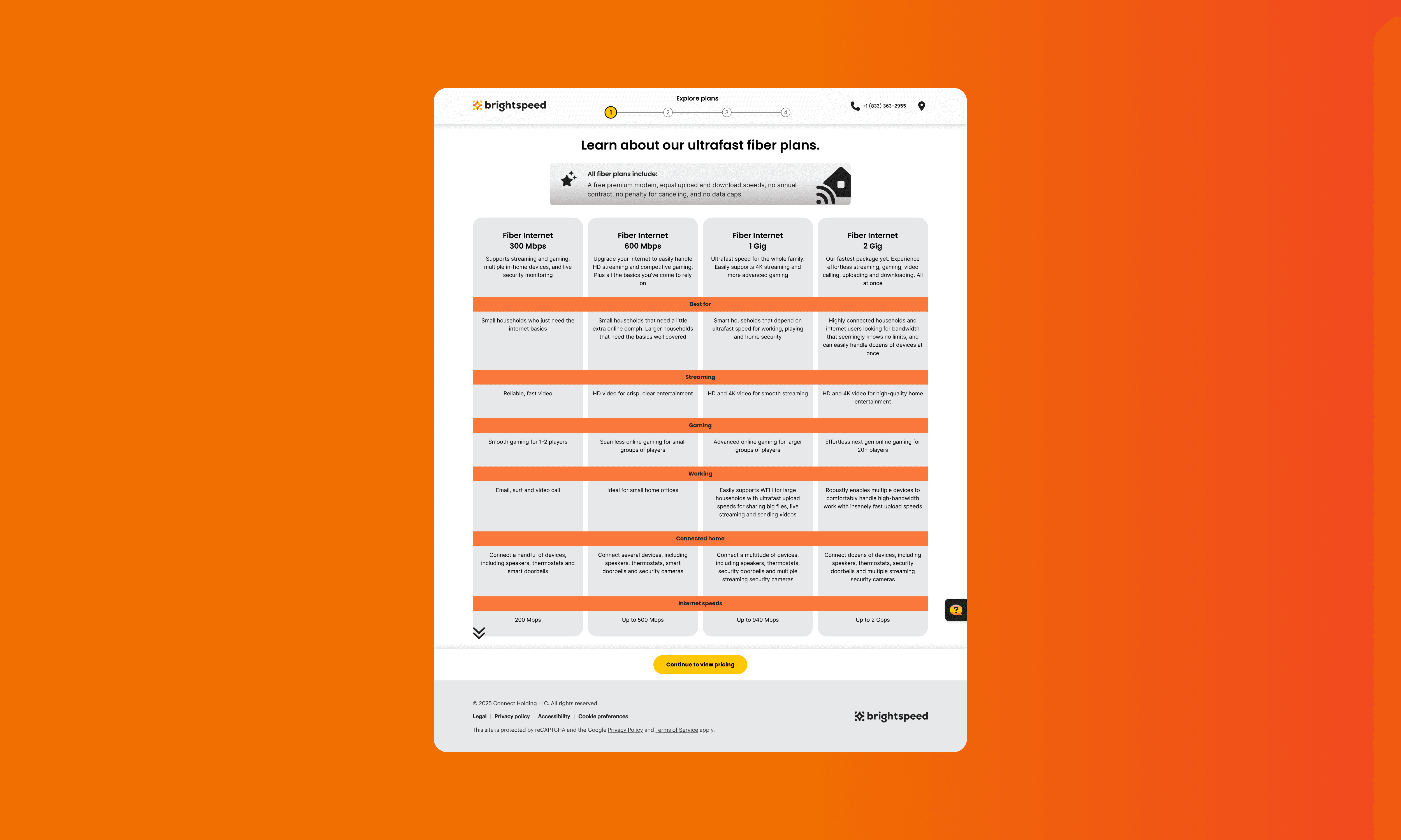
Atoms to a step. Text stack, button stack, and card come together as a plan card. Plan cards in 2-up, 3-up, and 4-up layouts, with the broadband label every plan is required to show, become Select a plan. The same atoms, in different states, become every other step in the flow.

App
Variables first. The app's atoms don't start from styles; they start from variables. 136 colors with light and dark modes, 76 type values, 27 sizing values, 13 spacing steps, and 8 radii, each defined once and read by every component in the library.